.png)
How do you transform an independent artist’s sound and story into a digital experience that’s as compelling, accessible, and unforgettable as the music itself?
This project was an interactive website that showcases an independent artist’s musical work with the goal of translating the artist’s sound and story into a cohesive digital experience.

Independent artists like Big Burss need a platform that reflects their identity while making it easy for fans to discover, engage with, and return to their music—all in a seamless, accessible digital experience.
5 users - 3 male and 2 female - ranging from 20-23 years old, were interviewed to find out user needs and thoughts regarding artist websites.
While the website is designed to be accessible and engaging for users of all ages who are interested in Big Burss’s music, the primary fan base falls within the 18-24 age range.
Age: 19
Location: Boston, MA
Occupation: College Student
Age: 21
Location: Manhattan, NY
Occupation: College Student

Age: 24
Location: Houston, TX
Occupation: Graphic Designer
.png)
Designing the user flow and IA of the website began with mapping out key user goals - discovering music, learning about the artist, accessing the artist’s shop, and a subscription option. Because the site had to have creative and interactive elements, there had to be a clear emphasis on keeping things simple and prioritizing minimal clicks to core actions.
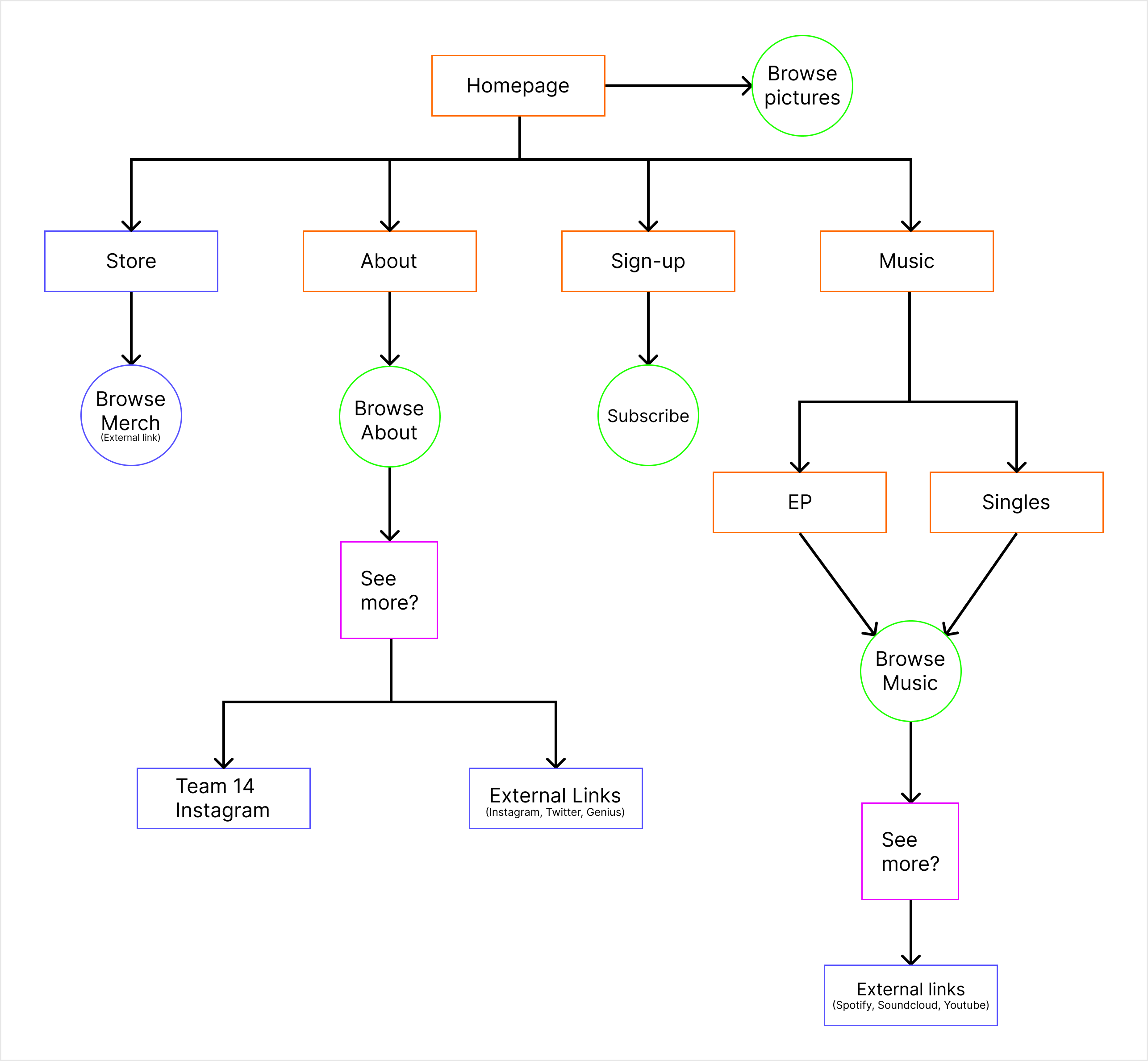
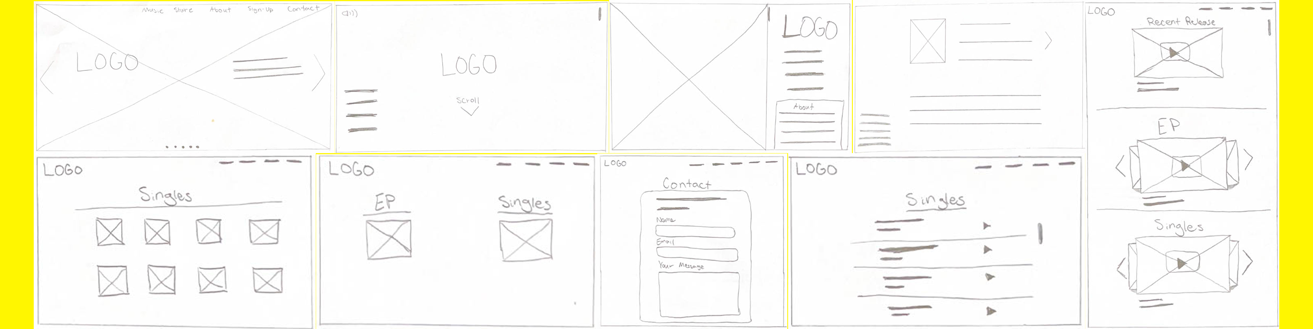
Low-fidelity wireframes for the prototype were sketched, then digitally created. These early renditions focused on the site’s hierarchy and clarity. ensuring that content was easy to scan and navigate.
Because I wanted to place emphasis on the music and interactive elements on the site, I focused on translating the user flow into clear, visual layouts that prioritized simplicity and usability.
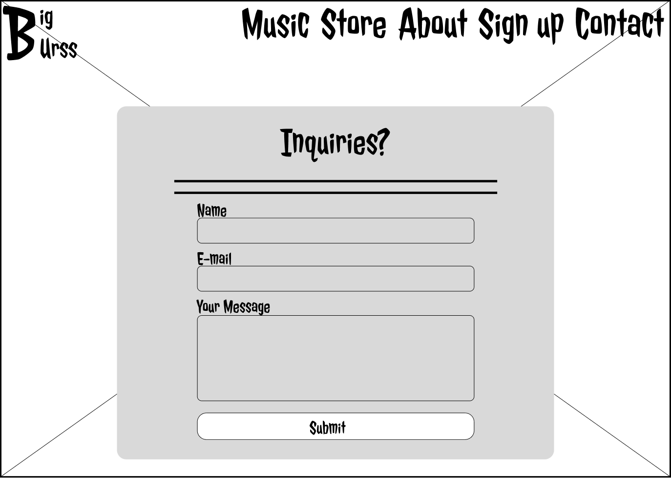
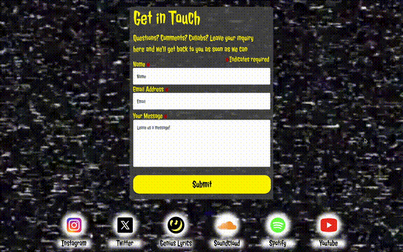
After gathering feedback from early usability testing and interviews, I found that a contact page would be a highly valued feature, and thus decided to incorporate it into the MVP moving forward.
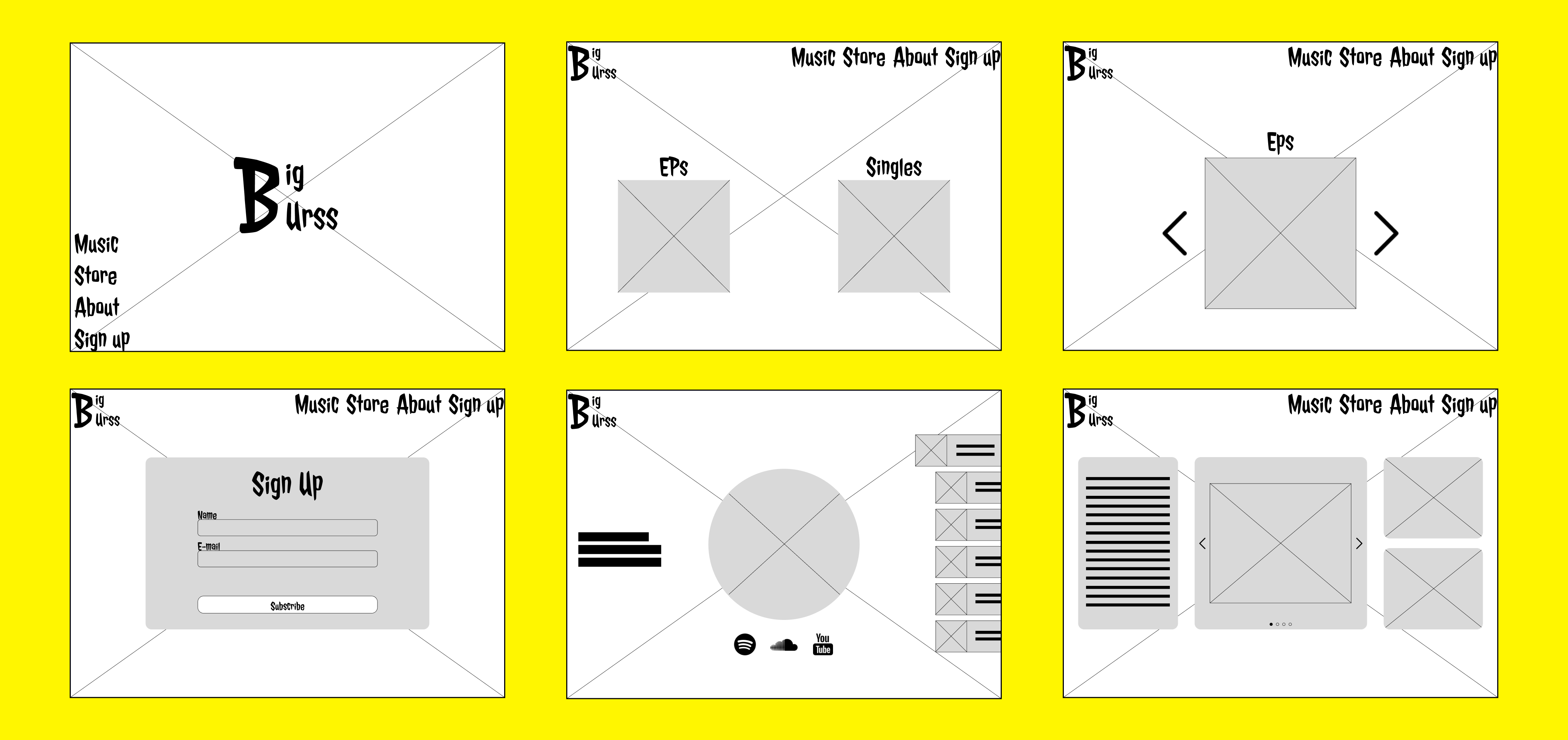
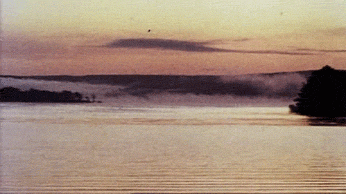
Although I had creative freedom to design the features and layout of the site, the background was chosen by the artist, so I was presented with the challenge of designing around that.
This being the case, I decided to go a more “retro” feeling aesthetic for the website, which also matched with the look and feel of Big Burss’s latest single.
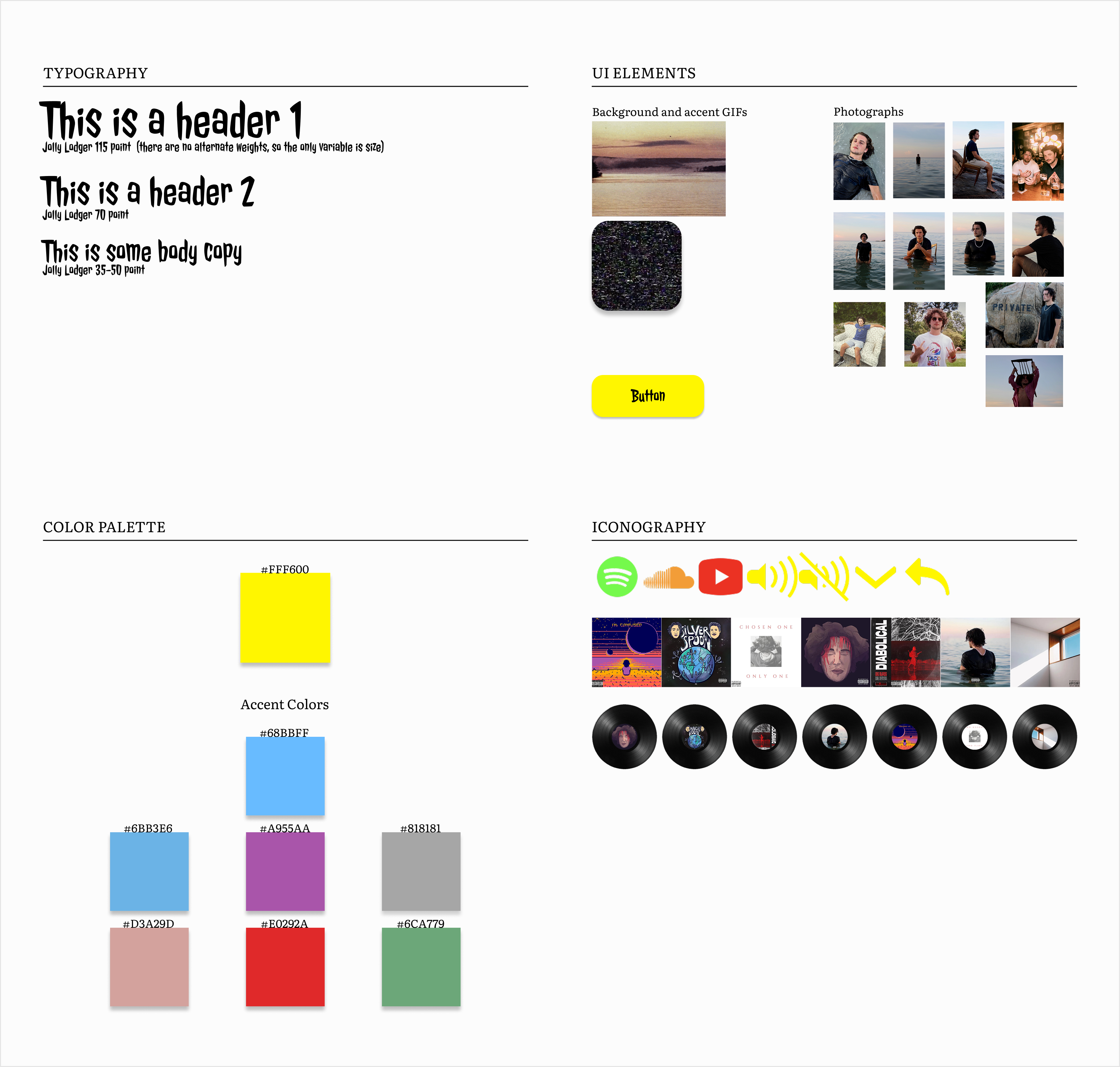
I created an easy to understand sticker sheet for individuals to use as a reference for the site’s UI elements
This website was designed to be goal oriented - in the sense that although the visuals were important, the user being able to engage with Big Burss and his content was the top priority.
Thus, I decided to place the focus for the individual pages on large visual areas in order to showcase the artist’s imagery, as well as minimalist but expressive typography.

Some sample questions asked during user interviews:
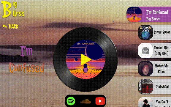

Although during initial designs, I had planned on making use of autoplay (thinking that it would enhance the experience for users with accessibility needs), this ended up being far from the case. Further user testing proved that the most common complaint/suggestion from users was that they did not want autoplay when exploring music.
Having fallen victim to the struggles of Netflix’s scroll-over autoplay feature myself, it was not a difficult choice to make, and this was iterated upon the final prototype through a play/pause button on the music exploration pages, as well as a sound toggle button on the homepage.
I went on to develop the site using CSS and HTML, and published it through a domain on GoDaddy.
Although this was a class project, after two weeks, we were able to observe a slight rise in people visiting Big Burss's streaming links. However, because the initial population of users was so small and localized to begin with, as well as there being no proper advertising done for the website, it was difficult to determine whether or not this increase in clicks was due to new users discovering Big Burss, or it was returning fans that just wanted to see the new website.
Based on user test feedback, users found the site to be engaging and easy to navigate.
The contact form was one of the most used features on the site (other than the music discovery page)
Designing for authenticity requires balance:
Translating an artist's unique personality into a digital experience taught me the importance of balancing creative expression with usability. I had to work around preserving artistic identity without compromising accessibility, legibility, or interaction design principles.
The importance and difficulties of collaboration:
Although the artist didn't actually give creative input on anything other than the background of the site, working directly with him emphasized the importance of open communication in understanding goals and tone when shaping a design that feels not only user friendly, but true to the client.

