
An AI-powered skincare assistant embedded into Sephora.com, delivering personalized skincare recommendations through an engaging, conversational interface, helping users shop smarter by increasing confidence and reducing the feeling of being overwhelmed.

In this day and age where appearances are beginning to matter more and more, many customers - especially men and skincare beginners - feel overwhelmed by the number of products available and unsure where to even start.
In order to understand user needs and frustrations, I conducted 6 user interviews, all skincare beginners, with men ranging from 21-30 years old.

Age: 27
Location: San Francisco, CA
Occupation: Project Manager
Marco has been using skincare products for years, especially for sun protection due to living in Florida. He’s interested in maintaining healthy, youthful-looking skin and is willing to spend on top-tier products. However, he’s always looking for new ways to optimize his routine.

Age: 25
Location: Saint Louis, MO
Occupation: Software Engineer
Caleb takes pride in his appearance but has mostly focused on hair and grooming. Recently, he’s been noticing early signs of aging and dryness. He’s open to expanding his skincare regimen but doesn’t want a long or overly complex routine.
.png)
Age: 24
Location: Nashville, TN
Occupation: Graphic Designer
Elias recently graduated from college and started his first job. He’s never had a skincare routine beyond washing his face in the shower. After a few breakouts and noticing his skin looking dull, he’s decided to take skincare more seriously, but he’s intimidated by Sephora’s large catalog.
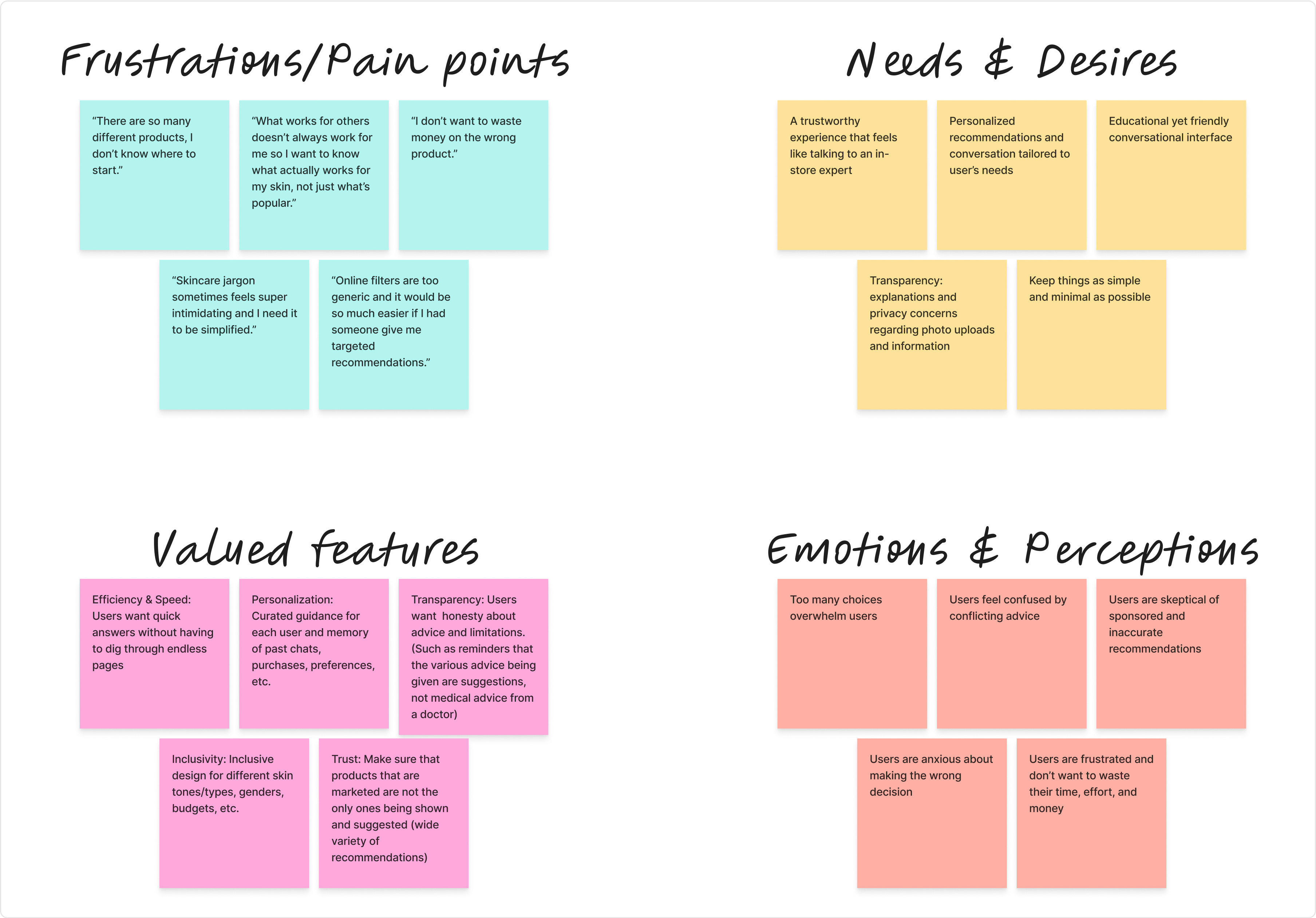
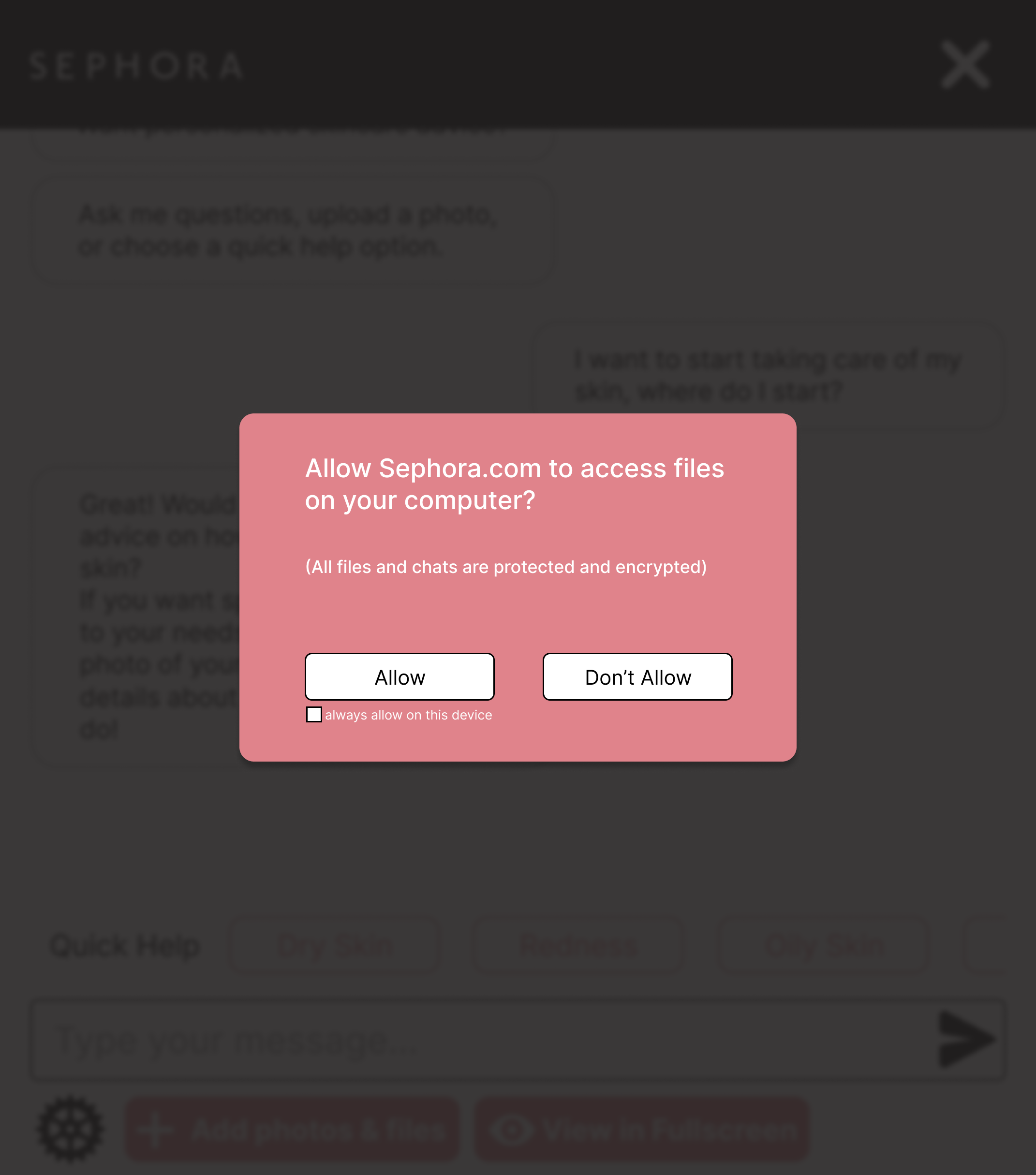
Sephora customers want the reassurance of in-store expertise translated into a fast, personalized, and trustworthy digital experience. Users are likely to adopt SephAIra if it reduces overwhelm, builds trust, and respects their privacy while delivering genuinely useful recommendations.

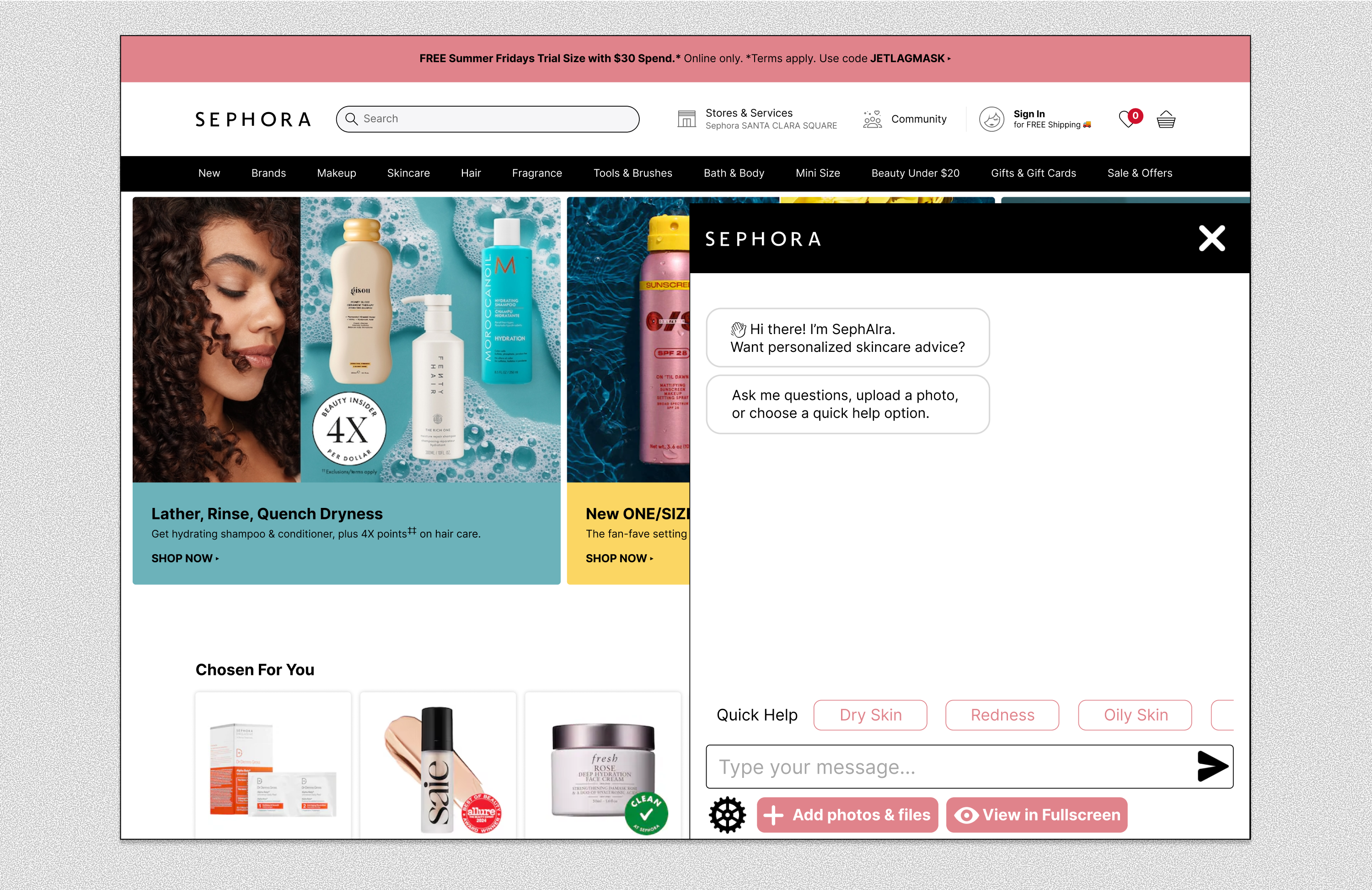
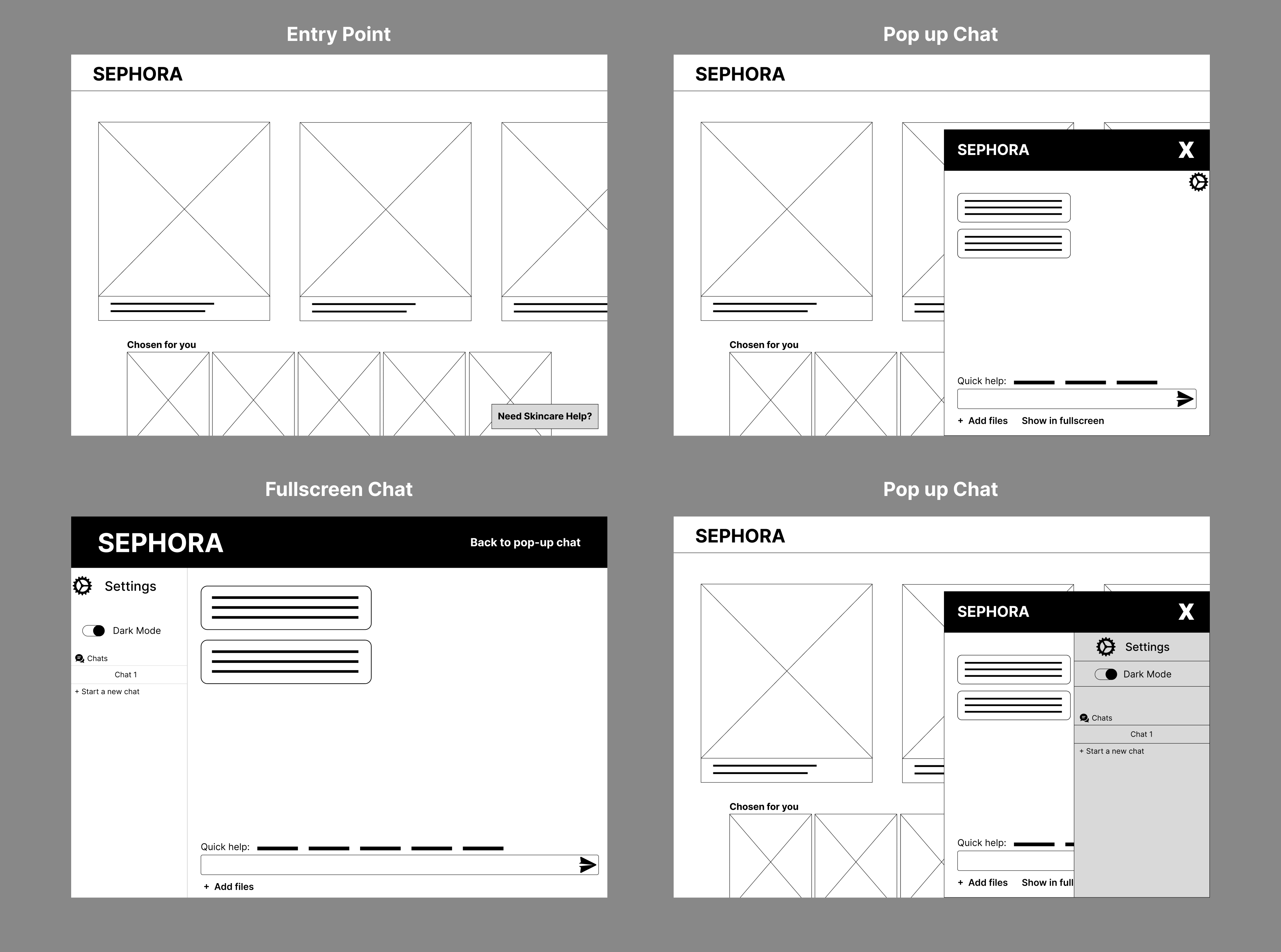
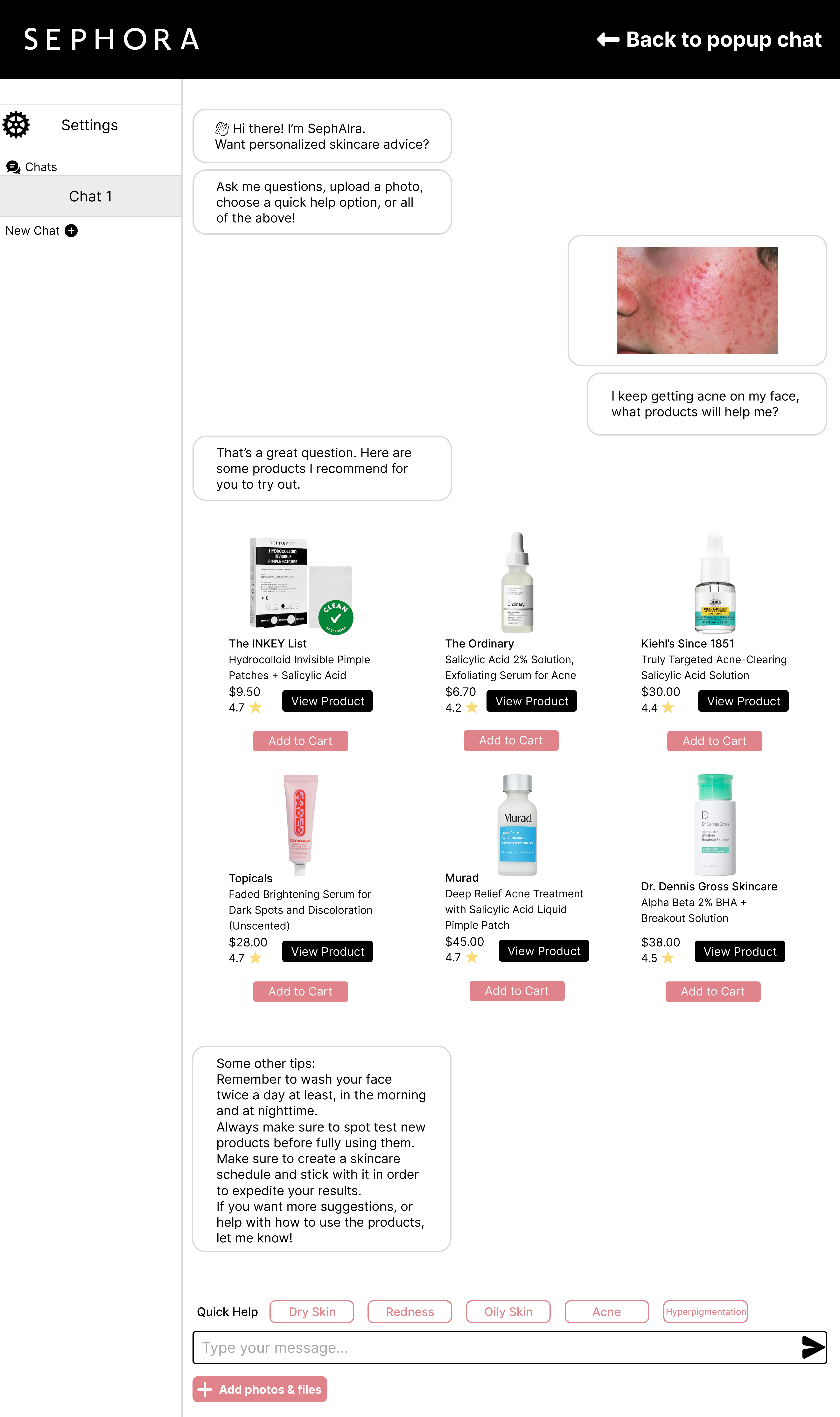
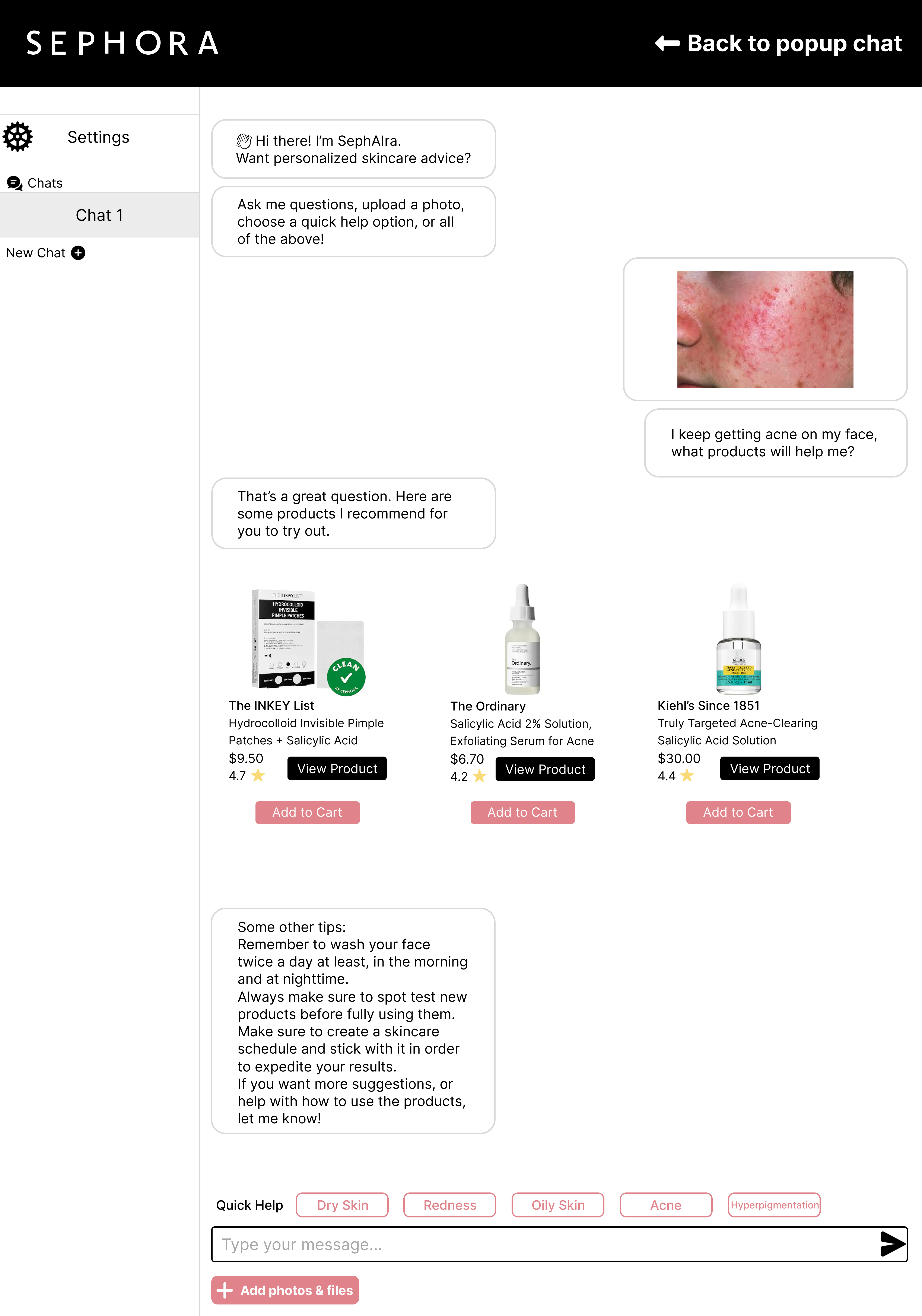
I chose this design because preliminary research revealed that some users prefer a lightweight pop-up for quick Q&A, while others wanted a full-page experience for photo analysis and routine building. This hybrid build supports both type of uses.
I began with low-fidelity wireframes that focused on basic structural layout and functionality over visuals and mapped the entry points and hybrid structure of the SephAIra chat feature.
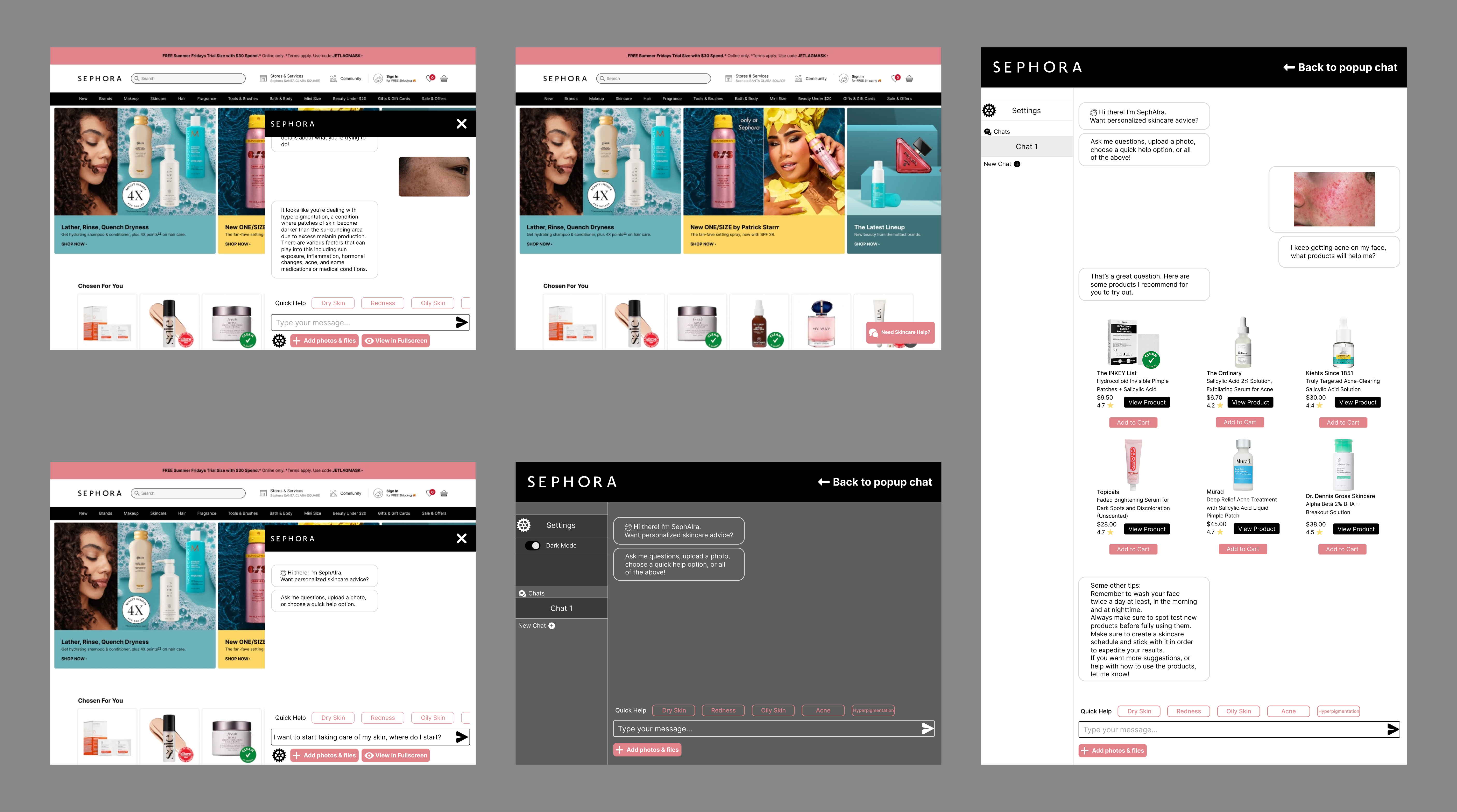
In addition to user testing with the prototype example chats I created, I also had participants simulate conversation with the SephAIra chatbot by interacting with GPT-4. Beforehand, I instructed the latter to act as an "AI chatbot on Sephora.com, helping users discover which products to use for specific scenarios and providing them with product links."
Following the launch of the MVP, some of the main metrics and KPIs to look for in understanding and measuring the success would be:
Granting the success of the MVP:
The "AI" isnt the experience, trust and context are:
The novelty of AI fades fast if it doesn't feel reliable or contextual. The further I got in this project, the more I realized that the success of a project such as SephAIra would depend less on what the AI could do, and more on how it explained itself. The framing of AI as an assistant, rather than an authority, would keep users more comfortable and engaged.
Designing for uncertainty is just as important, at times if not more, as designing for clarity:
Through researching and testing, I realized users didn't just need answers to their questions, they needed reassurance when they weren't sure what to even ask. This project taught me to design for hesitation by creating pathways for users who are unsure, curious, or even skeptical through things such as a friendly tone or a well placed prompt.

