

I think at some point in our lives, most (if not all) of us have had to experience the dreary and frustrating task of having to go to the doctor’s office to retrieve medical records or sitting through 20 minutes of elevator music trying to make an appointment at the clinic via phone call.
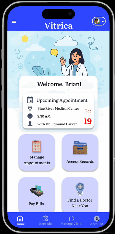
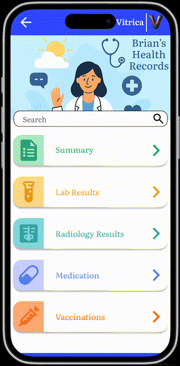
Vitrica is a mobile healthcare app designed to provide users with seamless access to their personal health data and that of their dependents. It enables secure sharing with providers or caregivers and streamlines tasks such as booking appointments and reviewing lab results.

Many health apps on the market today are cluttered, difficult to navigate, and often fail to provide holistic access of the user and their loved ones’ records, practically treating sharing as an afterthought. Users struggle with trust, usability, and outdated interfaces, often leading to app abandonment.
3 men and 2 women ranging from 22-48 years old, were interviewed in order to understand user needs and frustrations with existing health apps.
Vitrica was designed to support a wide range of users, from tech-savvy young adults managing their own personal health, to older generations - often parents - seeking a clear and dependable way to access and share their medical records.

A stay at home mother that loves reading and spending time with her children. With her eldest child getting ready to start going to school, she needs a way to access and share her child’s medical records, but being a mother of two boys, can’t find time to go to the doctor’s office.
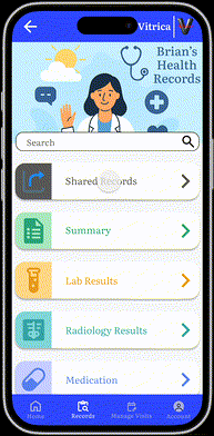
Brian is a college student who loves sports and staying active. He actively participates in student sports club organizations and works a part time job as a referee for these sports games, which means he has to consistently submit his medical records. He also takes care of his father, and desires a way to quickly access secure data.
Todd is a hardworking, passionate, single father that does nothing but work in order to support his daughter in whatever way he can. His daughter wants to participate in school sports, so he needs a way to easily make appointments with her provider, and share her health information with the school.

Designing Vitrica’s user flow and IA began with mapping out the most essential user goals - accessing/sharing records, booking appointments, finding nearby doctors, paying bills, and adding/editing proxy access accounts.


For initial wireframing, I stressed the importance of establishing a clean, function focused layout that prioritized ease of use and accessibility. Each screen was designed in mind of supporting a linear, logical user journey.
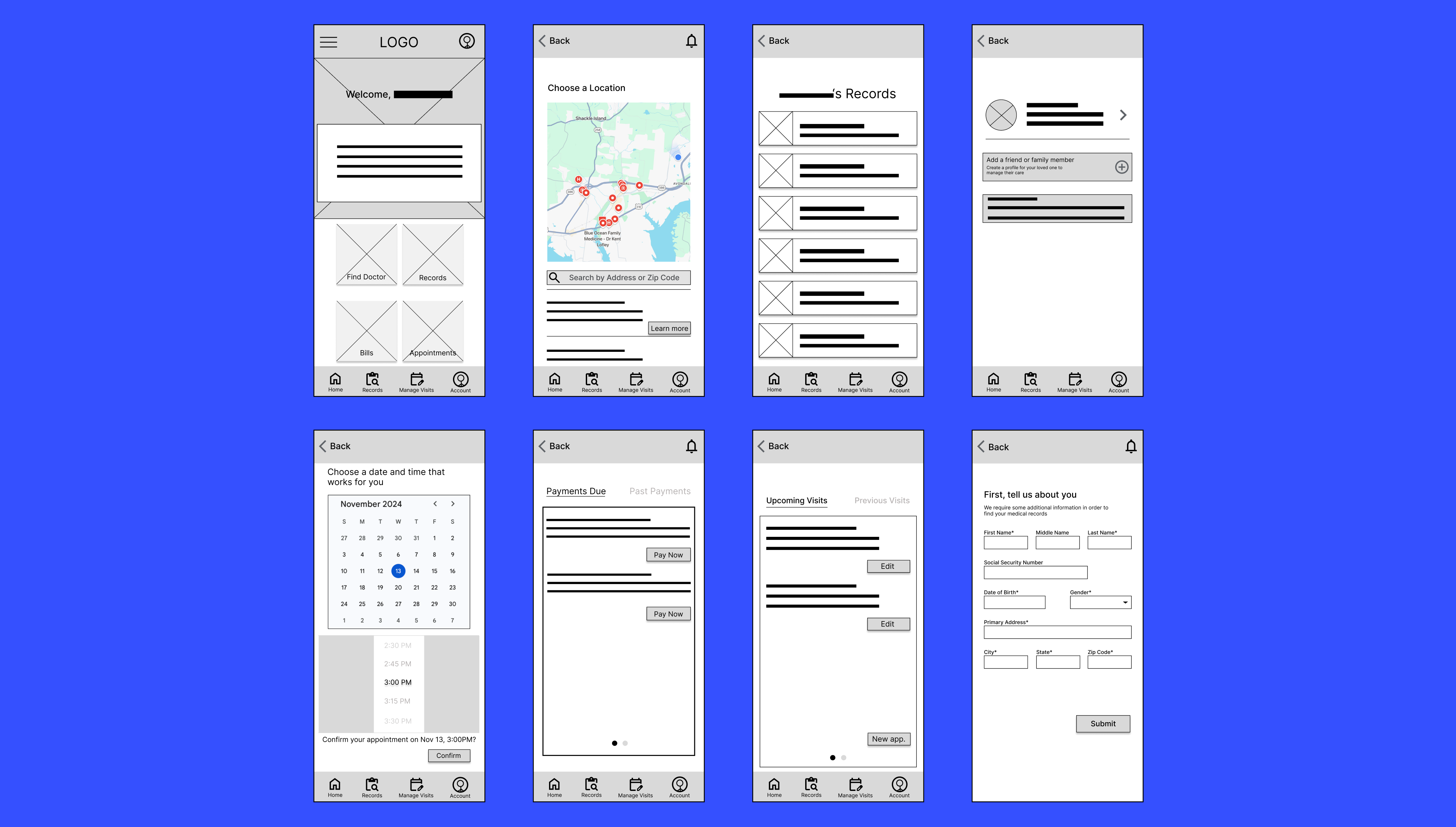
Feedback from early usability testing helped refine the structure and highlighted opportunities to add an additional feature heavily requested by users, which was updated in the high-fidelity mockups, as well as the user flow. (Messaging/chatting providers)

The name “Vitrica” comes from a blend of the words “Vital” and “Records,” giving a futuristic and trustworthy feel. A large “V” and an ECG line with the letters “itrica” became the focal point of inspiration to produce a logo that was both simple and recognizable.
%20ideas.png)
I created an easy to understand sticker sheet for individuals to use as a reference for Vitrica’s UI elements.
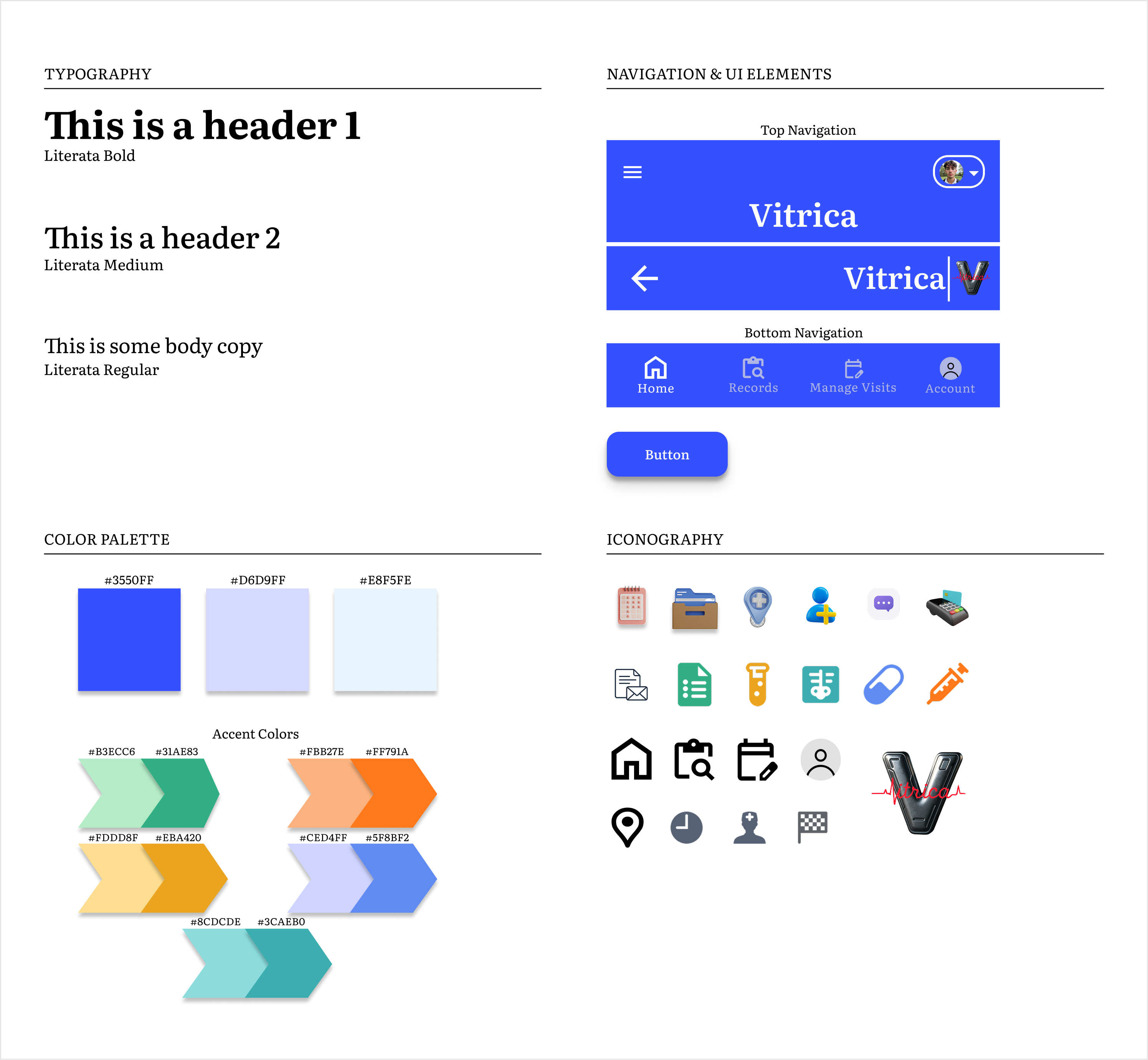
With the foundational wireframes in place, I transitioned to building the high-fidelity mockup and prototype in Figma. The main focus was bringing the visual identity of Vitrica to life and humanizing the experience by incorporating a calm, friendly color palette, modern typography, and custom illustrations.
Although not a real world project, during this phase, the main metric to find data on would be the user retention rate of the app. (as that being the issue in the problem statement)
Some sample questions asked during user interviews:
100% of participants were able to perform all tasks appointed to them with little to no difficulty.
The final iterative change I decided upon prior to passing the project onto development (had this been a real-world project) was adding real-time notifications showing when the recipient opened the record they received, being able to view user record sharing history, and a "revoke access" feature, enhancing the control the user has over the record sharing process and subsequently increasing overall trust.
In order to understand whether or not this MVP will be successful will have to do with KPIs such as: quantity of users and their activity, user retention rates, task completion/error rates, and feature usage. Is the product being used properly and consistently? How? By who?
Once these post-launch metrics are more clearly discovered, we can determine the features that are worth iterating upon.
1. Depending on the success rate and user feedback, tailor which features on the app need to be boosted/tweaked or potentially even removed.
2. Building and expanding partnerships with hospitals/providers in order to integrate more external systems for seamless record import.
3. Explore potential feature expansions such as: integration with wearable devices and AI-driven health insights.
Designing Vitrica really challenged me to combine functionality, empathy, and clarity in a high-stakes context. It taught me the importance of not only understanding user pain points but also anticipating how trust and emotion can heavily play a role in a digital setting. I felt proud and inspired to have created an experience that users felt confident and comfortable enough to use.
One thing I realized during this project was that prioritizing the user experience does not mean things are restricted only to thinking about the user. Especially in the context of innovating a full concept from beginning to end, not only did I need to think about the needs of the user, but also the business and technical side as well. This journey allowed me to more deeply grasp the design process to include users, research and business goals.

